 If you are going to be comfortable with typography there are some key terms you should know. This isn’t everything you should know about, but it is a good place to start if you are not super familiar with typography terms. Another great resource for this is also called Type Terms. It is self described as – the perfect tool for designers to learn the basics of typographic terminology. Designers often get comfortable throwing different type and design terminologies around – it is helpful to remember that not everyone speaks this language, but it is easy to teach if people want to learn. Let’s get started by covering 5 popular type terms.
Baseline
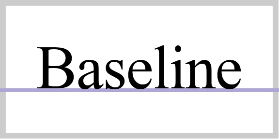
The baseline is the imaginary line upon which a line of text rests. The baseline is the point from which other elements of type are measured including x-height and leading.
Leading
This is known as the space between the baseline and one line of type. It comes from the days of hot metal type when strips of lead were placed between rows of type to provide line spacing.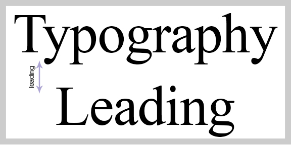
x-height
X-height is the distance between the baseline of a line of type and tops of the main body of lower case letters, not including excluding ascenders or descenders. What are ascenders and descenders you say?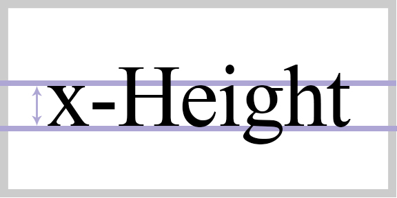
Ascenders
An upward vertical stroke found on the part of lowercase letters that extends above a typefaces x-height. This can also be called an extender.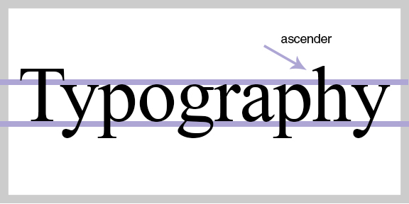
Descenders
The part of the letters that extends below the baseline. Also referred to as extender, tail, or loop. In most fonts they are on lowercase letters like g, j, q, p, and y.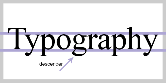
*Some fonts read better with increased leading because they have long ascenders and descenders.
All these elements work together and are friends. Once you know one of them it is easy to remember the others because they are related. There are so many other terms you will come across when it comes to typography, but these are the ones you will probably hear about most often.
Want to learn more? Typophile is a great community resource to check out.

Leave a Reply