Where in your design do people look first? Where do they look next? How much control do you have when it comes to guiding the viewer’s eye? Let’s talk about how designers can help direct the eye of the viewer through a composition.
Our eyes take in a lot more visual information than our brain can consciously process. We want to focus on the most compelling information so we selectively look at what we think most important. This is called selective attention.
Studies have shown that we can be distracted by visual information even when it’s not relevant. If it’s attractive enough, it’ll grab our attention consciously or subconsciously. Great marketers understanding this, and so do designers and artists. Learning how to harness this is an effective tool.
The movement of our eyes through a composition are not random. We look for desired information and our attention is pulled to specific elements that are prominently emphasized. We quickly skip over what we think is irrelevant and look for meaning in what we focus on.
Different people might scan the same design in different ways. Each of us is unique and will think different information more important. But there are some things we can do as designers to help guide viewers.
Visual Weight
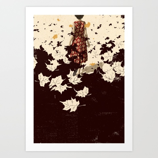
Visual weight revolves around the idea that distinct elements in a design have varying heaviness relative to each other. Sometimes visual weight is obvious, such as in the case where larger objects appear heavier than smaller objects because they take up more space. But it isn’t always that simple and there are other ways to achieve weight – adding something dark can add visually “heavy” weight, so can putting something in an interesting place, or the more complex something is the heavier it looks visually. There are lots of ways to achieve visual weight and the nice part about all this is that it comes pretty naturally to us. You will know it when you see it.
Balance & Emphasis
Both balance and emphasis work with and affect visual weight.
Balance is the distribution of the visual weight of objects, colors, texture, and space. If the design was a scale, these elements should be balanced to make a design feel stable. In symmetrical balance, the elements used on one side of the design are similar to those on the other side; in asymmetrical balance, the sides are different but still give a sense of balance to the work.
Emphasis creates a focal point in a design; it is how we bring attention to what is most important. Emphasis is what catches the eye and makes the viewer stop and look at the image. Without emphasis, without getting the viewer to look at the image, communication cannot occur.
Movement
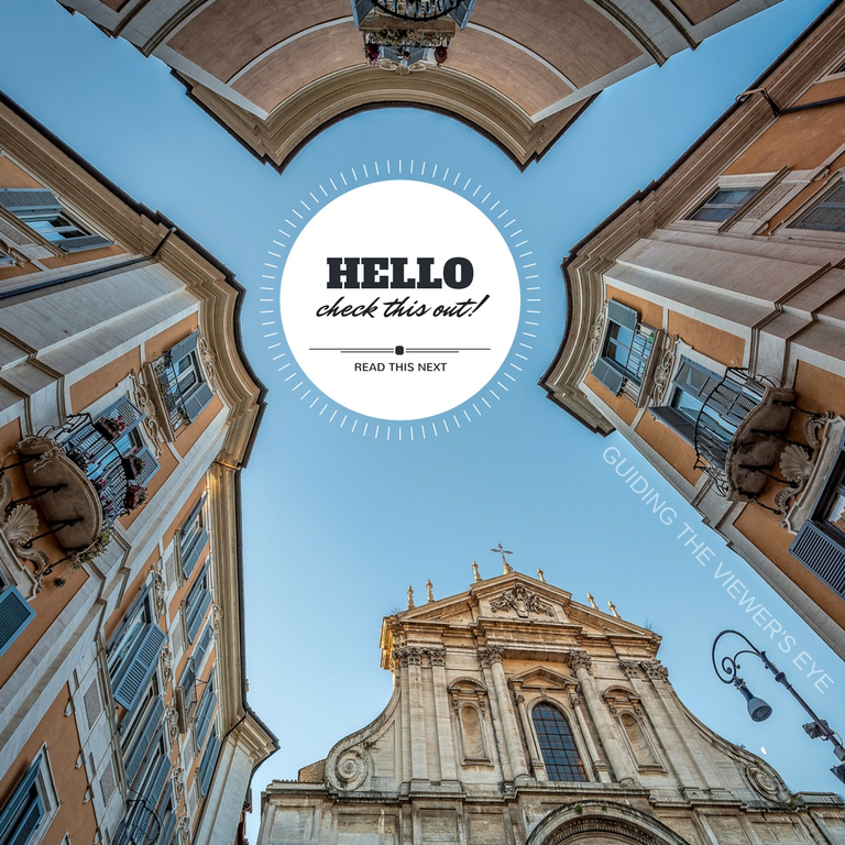
Movement is the path the viewer’s eye takes through the work of art, often to focal areas. Such movement can be directed along lines, edges, shape, and color within the work of art.
Eye Gaze
Our brains are wired to detect and recognize human faces. In compositions we’re drawn to pictures of people and specifically their eyes.
We automatically move our eyes in the direction we see someone else looking. If you want someone to look in a specific direction in your design, you can place a human face looking in that direction.
Summary
By creating a hierarchy of importance through visual weight you can help guide viewers through your compositions. You can take that further and employ the powers of balance, emphasis, movement, and eye gaze to increase the probability that viewers will see what you want them to see. Learning these design fundamentals can give your designs super powers! What are some of your favorite ways to direct a viewer’s eye?
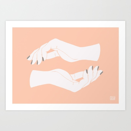
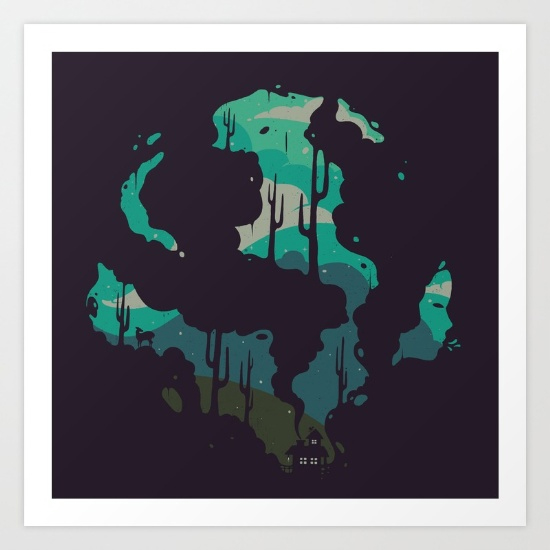
{example images from here}

Leave a Reply