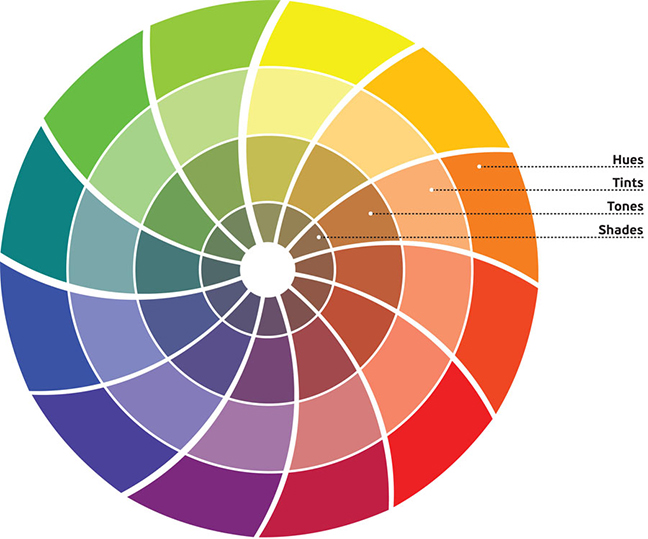
 If you’re going to use color effectively, you’ll need to know some color concepts and color theory terminology. A thorough working knowledge of concepts like tints, tones, and shades is key to creating your own awesome color schemes. In Part 1 of this color theory series I covered the basics of different color families. Here, we’ll go over what affects a given color, such as adding gray, white or black to the pure hue.
Hue is the most basic of color terms and basically denotes an object’s color. When we say “blue,” “green” or “red,” we’re talking about hue. So simply put hue is just another way of saying color – they mean the same thing and are interchangeable.
Now that we have that established we can start having some fun with colors.
Tints
Tints are created when you add white to any hue on the color wheel. This will lighten and desaturate the hue, making it less intense. Tints are often referred to as pastel colors, and many feel they are calmer, quieter colors.
Tones
Tones are created when gray is added to a hue. You could also say that black & white have been added to the hue. Tones are generally duller or softer looking than pure hues.
Tones are sometimes easier to use in designs and are forgiving. Tones appear less saturated or intense than the original hue. Tones can reveal subtle and complex qualities in a hue or combination of hues, and are more true to the way we see colors in the real world.
Shades
A shade is created when black is added to a hue, making it darker.
This results in a rich, often more intense and darker color. This should be done sparingly as it can quickly get out of control and make the hue look muddy. You can also darken a hue by adding a darker hue rather than black.
Color Wrap Up
Obviously doing this on a computer is going to be more forgiving than if you are mixing paints, but the same techniques apply. Understanding the basic color language can go a long way when creating a new project, working with others on something that is color based, or fine tuning colors for a particular project. Next week we will wrap up this series with part 3 – stay tuned!
{color wheel image from here}


Leave a Reply