 The American typographer Beatrice Warde wrote a famous essay, ‘The Crystal Goblet, or Printing Should Be Invisible’, in which she explained that typography was like a crystal wine glass – if you noticed the glass you wouldn’t notice the perfection of the wine. We now live in a world where communication takes on many different forms. Through typography – its style, size, and color – we can convey meaning in our work. In some cases, we might find that the glass is more important than the wine.
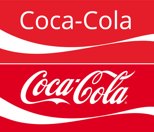
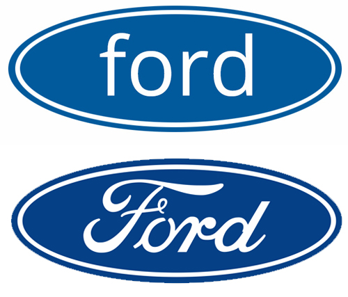
Some brands are identified solely by their typeface. Take that away and you are taking away the meaning of that particular brand. Typography and brand recognition can go hand in hand. Look at what happens when brand fonts are simplified-

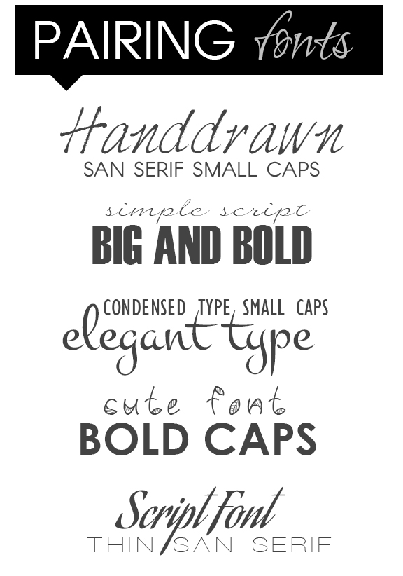
 Gross right? But enough typography nerd talk. Simply put typography can make or break a design and making good a font pairing is paramount. Becoming an expert on typography takes a lot of time. You can learn all the rules, but you also have to exercise aesthetic judgement at all times, it can be complicated. Let’s go over a few tips that will help you make some good design choices – without having to become a typography expert (but that would be a worthwhile endeavor if you are into it).
You can also check out this cool tool that helps you match fonts. Up next we will talk about where to find the best fonts online!


Leave a Reply